Solipsism Gradient

Rainer Brockerhoff’s blog

Browsing Posts published in February, 2008

Re: Design snowball

No comments

uliwitness wrote:

Oh, BTW, also found your review of the FireWire power specs interesting. I was hoping someone with better electrical skills than me would eventually post the fundamental maths involved to prove/disprove the “No FireWire cuz it needs too much juice” theory that’s been bandied about.

The post was already too long, so I didn’t mention the possibility of using the Sony 4-pin FireWire connector, which doesn’t supply any power; it’s also much smaller, getting around some of the space argument too.

Still, it’d be a hassle needing an external power supply for those small portable FW drives; most of them don’t come with one. Also I’m not sure whether Apple would have to pay Sony for that.

As I also said previously, each extra USB connector would also need more space and power, though less (2.5W) than FireWire.

Re: Design snowball

No comments

Posted by uliwitness:

“When it comes to Japanese PC manufacturers, their manufacturing plants will complain or add their own technical efforts to lower cost, if a proposed structural design was insufficient,” one of the engineers said. “The MacBook Air gives me an impression that its manufacturing plant packaged the computer exactly as ordered by Apple.”

Rainer,

thanks for posting this — it mirrors exactly the thoughts I had when I read this news bit, and now I don’t have to coherently blog about it anymore.

FWIW, from what I heard, this is a common thing with Asian manufacturers. They like to improve products, but since they usually don’t have the whole list of why something should be done this way and not another, the customer of these manufacturing plants isn’t always happy with that.

Some western companies have “solved” this by putting QA guys in place that will babysit the manufacturers and make sure stuff gets produced the way they requested it, for exactly that reason.

I guess this is a cultural issue that will have to be resolved by understanding each other…

Oh, BTW, also found your review of the FireWire power specs interesting. I was hoping someone with better electrical skills than me would eventually post the fundamental maths involved to prove/disprove the “No FireWire cuz it needs too much juice” theory that’s been bandied about.

Re: Design snowball

No comments

The snowball effect I was writing about is also very evident in the design of the MacBook Air. I’ve posted before about some aspects of this (I was wrong about it having fewer internal screws, though).

Just saw this: Japanese engineers trash MacBook Air. Here’s the original article in somewhat clumsy English. Some choice quotes:

“Can we say that the MacBook Air has a perfect, sophisticated external appearance, but its insides are full of waste?”

What astonished all those engineers was the fact that the computer had a very costly structure. For example, it used an extremely large number of screws to attach components. About 30 screws were used to attach the keyboard alone.

“When it comes to Japanese PC manufacturers, their manufacturing plants will complain or add their own technical efforts to lower cost, if a proposed structural design was insufficient,” one of the engineers said. “The MacBook Air gives me an impression that its manufacturing plant packaged the computer exactly as ordered by Apple.”

Based on the results of our teardown project, we guess Apple is not paying much attention to both workmanship of the hardware design and comprehensive cost reduction…The MacBook Air’s mysterious internal design might be a violent antithesis against Japanese manufacturing, which allows no compromise even in detailed parts of the hardware.

This is a very interesting insight into manufacturing. Can you imagine Steve Jobs’ reaction to somebody at the Air factory deciding to take out 25 of the 30 screws that hold the keyboard? Heads would roll!

No doubt all those screws (and the other things they considered “waste”) contribute to the Air’s extremely solid feel that’s remarked upon by everybody who has handled one. Contrast this to all the “this thing must be soo fragile” comments, just after the launch, by people who had not handled one. Obviously people are used to small electronic devices following the (apparent) Japanese practice of shaving off internal “waste” to save a little space and money and ignore the consequence of a flimsy feel… something that would be especially accentuated in such a thin device as the Air.

So, this article betrays a fundamental misunderstanding of Apple’s design strengths and intentions. Their definition of “workmanship and… cost reduction” is very different. From what I can tell, the Air was designed from the outset to be extremely thin and rugged, while maintaining adequate battery life and performance. These considerations snowball to the extent that the battery uses up 2/3 of the space, and seems to be (along with the keyboard) itself a structural element.

Everything else flows logically from that. To put in a FireWire connector means reserving resources for a 7W additional power drain – that’s 1A extra current at the 7.2V battery. It also means an extra power supply to jack this up to the 9 to 12V required at the connector, extra PCB traces, and so forth. The battery has a capacity of 37 watt-hours, meaning that at the rated duration of 5 hours, the average power draw is slightly over 7W; this would double when a FireWire drive is connected, meaning battery life would be only half, 2.5 hours. Also, the extra connector would mean widening the flip-down door and shaving off maybe 2cm off the battery on that side… more capacity reduction. The 45W external power supply would also have to be beefed up, and the internal charging circuitry as well… this means more heat dissipation. It would probably have been necessary to make the battery itself thicker, maybe 5mm or more.

Now look at a typical Ethernet connector; it’s thicker than the Air’s door, so some millimeters would have had to be added to the Air’s thickness, too; as well as taking the extra chunk out of the battery as well.

Same applies to an internal DVD drive. If it doesn’t work as a burner too, they’d have complained – but imagine the power requirements, or read the Lenovo x300 review; Lenovo engineers are very capable too, but they decided on different trade-offs. I have handled some other brands of small laptops from Toshiba and I must say I was unimpressed by the feel and finish.

Finally, imagine the Air with a removable battery. This means extra connectors, a case opening, of course with either a full-width extra wall (meaning at least 4mm extra thickness) or some heavy-duty latches (considering the battery is 2/3 of the size and a similar proportion of the weight of the Air). Consider the loss of rigidity that would imply, and the extra size and weight that would have to be “wasted” to counteract that.

So that’s my point. Any change in the Air’s design immediately snowballs into a larger, heavier, hotter and (probably) less solid-feeling machine. Jobs obviously thought it was worthwhile to concentrate on those aspects, and it’s rather shortsighted to conclude that “Apple is not paying much attention to … workmanship”.

Design snowball

No comments

Interesting how some design choices you make early on cause a “snowball effect” – many product details end up depending on these choices. Sometimes you have to go back and change the initial direction of the snowball, so to speak, because some of those end effects turns out to be unacceptable.

When I started rewriting Quay for the first 1.1 public beta, I decided to change the way the background application (QuayMenu) was run. In 1.0, a Quay icon in the Dock was a file hidden away inside the Quay database package. When the user clicked on the icon, QuayMenu started up (if it wasn’t running already), and presented the menu. This simple scheme interfered not at all with the Dock itself but depended on several tricks to find out, approximately, the on-screen location of the clicked icon – something that a normal application doesn’t need to know. (It also didn’t work at all if you accessed the Dock over keyboard navigation.)

For 1.1, I decided to convert QuayMenu into a LaunchAgent: a per-user background application that runs constantly and is restarted by the system if it fails. I also worked out a way to have QuayMenu monitor click and keyboard events for the Dock, and use the Accessibility APIs to work out exact locations and details of a clicked Dock icon. So when the user clicks on a Dock icon, QuayMenu checks out if it ought to handle that click and pass it on if not.

This design decision had immediate consequences. It’s much easier to control (and update) a LaunchAgent if it’s in a fixed, known place. I decided to store the main Quay application inside the Quay database itself (which is in ~/Library/Application Support), both to prevent the user from moving it and to have a single known location for updating. The idea of having everything inside ~/Library stems from complaints I had about XRay storing stuff inside /Library, years before. So there was an a priori concern to make Quay a simple, no-hassle, per-user application; nothing stored outside the user’s home folder, no administrator password needed, no security concerns.

However, this immediately conflicted with the need of using the Accessibility API. Basically, if you use this API to ask other applications about their user interface, you have two options. You can wimp out and ask the user to turn on “Enable access for assistive devices” in the Universal Access preference panel, or you can run a “trusted” accessibility client. The first option means that you depend on the user having this turned on all the time; if it gets turned off, things stop working and you have to show a dialog asking for it to be turned on again; clumsy. Also, some people (including myself) don’t like turning this on because it changes the way tabbing between text fields behaves – it then tabs over buttons too.

The second option – running as a trusted client – was the better one, then. However, it too comes with a trade-off. A trusted accessibility client runs “setgid 90”, meaning the executable is forced to run from the special “accessibility” group. This is a tamer version of the tricky, all-powerful and potentially unsafe “setuid root” executable; its only advantage over a plain vanilla executable is that it can see (and affect) other applications’ user interface elements. However, there’s one common aspect; to turn the setgid bit on, you need to ask for an administrator password. As a side-effect, copying the executable to another place turns the bit off again, and it’s ignored altogether if run from an external volume or a disk image.

All this meant that I would have to write an installer to move the applications into their place, ask for an administrator password and turn on the setgid bit. Apple’s guidelines say that in such a case you should do a standard Apple Installer package and have all this accomplished by scripts inside the package. I decided against that for several reasons.

One, it’s harder to check an installer package against unauthorized modifications, while an installer application can use code signing to prevent those. Personally, after some bad experiences with badly-written install scripts, I distrust installer packages a bit more than separate installers – although I know people who distrust installers even more. The third option, of writing a self-checking, self-repairing application that could be drop-installed anywhere – as Quay 1.0x was – I reluctantly discarded. Some people prefer to have multiple copies of applications available, some use weird separate application folders (as was usual in the Classic days), and if you back up your applications with Time Machine, you’d have copies right there which shouldn’t be accessed except when restoring from the backup volume.

So the decision of writing a suitably self-explanatory and “just works”-type installer appears to be the right one. It’s actually working pretty well in the current (1.1b2) beta… except that I’d forgotten one important thing. FileVault (on the list of system features I don’t use myself) is based on a special “sparse” disk image that is mounted in place of your home folder. Meaning that, if you use FileVault, you can’t have setuid or setgid executables inside your home folder – and certainly not inside ~/Library.

OK, so I’m dutifully rewriting my installer to move everything into /Library which has no such limitations. An added advantage is that now there’s a single copy of Quay installed for all users; but should the serial number, then, also be valid for all users? That means the added hassle of separating the preferences into yet another file, installed into /Library/Preferences; one more thing to uninstall. An added disadvantage is that, now, the uninstaller – which I’m building into the Quay application itself – will need to ask for an administrator password, too. Or maybe I should have a setuid root uninstaller tool inside the application; I don’t like that either, but having such a tool would also mean an easy way of adding extra functionality to the Quay popups.

Well, all these are trade-offs, and I hope that when 1.1 (final) comes out, that the net effect will be positive. If all goes well, 1.1b3 should be out sometime next week, and you’ll have the chance to comment. Stay tuned.

Connectium Tremens

No comments

My ADSL line has been down for almost 24 hours now – and it’s promised to be up in a few hours. But then, they already said that yesterday, to no effect . icon_rolleyes.gif First time it’s been down in over a year, so I can’t complain much.

I’m posting this from my neighbor’s poky connection; if you’ve e-mailed me in the last 24 hours, my apologies. It may still take some time before I can reply.

Re: Quay vs. 10.5.2

No comments

As predictable, interest in Quay has flagged a little with the release of 10.5.2. To quote one comment:

…pointless… since 10.5.2 brings back the functionality.

Well, in a certain way, true; to the extent that, once Apple shipped TextEdit, it’s pointless to use other text editors; it’s free and edits text, right?

Well, not really. I’ve changed the Quay product page to explain:

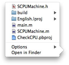
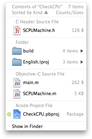
So why should you use Quay at all? Extra information, more flexibility. For one, the Dock’s popups are limited to about 500 items; Quay’s limit is in the tens of thousands. You can have a Quay popup on both sides of the Dock; Apple has them only on the document size.

And some comparative screenshots (this one is for “Sort by Kind”, 10.5.2’s popup is on the right):

Let’s hope this makes my point.

Re: Quay vs. 10.5.2

No comments

Mac OS X 10.5.2 (9C31) came out yesterday and I’m running it now. Seems they declared it stable enough to release… icon_wink.gif

So I’m declaring 1.1b2 stable enough to release too. I’m just checking if everything’s still working and updating the documentation; expect a release later today.

If you’ve installed 10.5.2, you’ll see an extra menu item in Quay’s general preference popup (option-command-click on the Dock divider stripe), to make Quay act only on Stacks set to “List” view. Some other 10.5.2-only goodies will show up in the next (and hopefully, final) 1.1.

I’ve gotten a serious amount of feedback on this beta. Thanks to all of you who sent in bug reports and suggestions. It’s the first shareware I’ve written for a larger audience and I couldn’t have foreseen all those various operating conditions without this sort of feedback.

Re: Quay vs. 10.5.2

No comments

OK, Quay 1.1b1 is out. Get it here.

Thanks to all who’ve sent in bug reports and suggestions. Quay 1.1b2 (or 1.1 final, let’s hope) will be out in a week or so.

Photos licensed by Creative Commons license. Unless otherwise noted, content © 2002-2024 by Rainer Brockerhoff. Iravan child theme by Rainer Brockerhoff, based on Arjuna-X, a WordPress Theme by SRS Solutions. jQuery UI based on Aristo.