Solipsism Gradient

Rainer Brockerhoff’s blog

Design snowball

No comments

Interesting how some design choices you make early on cause a “snowball effect” – many product details end up depending on these choices. Sometimes you have to go back and change the initial direction of the snowball, so to speak, because some of those end effects turns out to be unacceptable.

When I started rewriting Quay for the first 1.1 public beta, I decided to change the way the background application (QuayMenu) was run. In 1.0, a Quay icon in the Dock was a file hidden away inside the Quay database package. When the user clicked on the icon, QuayMenu started up (if it wasn’t running already), and presented the menu. This simple scheme interfered not at all with the Dock itself but depended on several tricks to find out, approximately, the on-screen location of the clicked icon – something that a normal application doesn’t need to know. (It also didn’t work at all if you accessed the Dock over keyboard navigation.)

For 1.1, I decided to convert QuayMenu into a LaunchAgent: a per-user background application that runs constantly and is restarted by the system if it fails. I also worked out a way to have QuayMenu monitor click and keyboard events for the Dock, and use the Accessibility APIs to work out exact locations and details of a clicked Dock icon. So when the user clicks on a Dock icon, QuayMenu checks out if it ought to handle that click and pass it on if not.

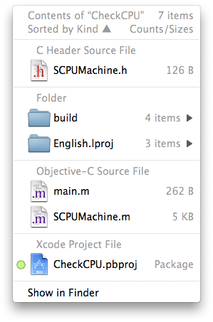
This design decision had immediate consequences. It’s much easier to control (and update) a LaunchAgent if it’s in a fixed, known place. I decided to store the main Quay application inside the Quay database itself (which is in ~/Library/Application Support), both to prevent the user from moving it and to have a single known location for updating. The idea of having everything inside ~/Library stems from complaints I had about XRay storing stuff inside /Library, years before. So there was an a priori concern to make Quay a simple, no-hassle, per-user application; nothing stored outside the user’s home folder, no administrator password needed, no security concerns.

However, this immediately conflicted with the need of using the Accessibility API. Basically, if you use this API to ask other applications about their user interface, you have two options. You can wimp out and ask the user to turn on “Enable access for assistive devices” in the Universal Access preference panel, or you can run a “trusted” accessibility client. The first option means that you depend on the user having this turned on all the time; if it gets turned off, things stop working and you have to show a dialog asking for it to be turned on again; clumsy. Also, some people (including myself) don’t like turning this on because it changes the way tabbing between text fields behaves – it then tabs over buttons too.

The second option – running as a trusted client – was the better one, then. However, it too comes with a trade-off. A trusted accessibility client runs “setgid 90”, meaning the executable is forced to run from the special “accessibility” group. This is a tamer version of the tricky, all-powerful and potentially unsafe “setuid root” executable; its only advantage over a plain vanilla executable is that it can see (and affect) other applications’ user interface elements. However, there’s one common aspect; to turn the setgid bit on, you need to ask for an administrator password. As a side-effect, copying the executable to another place turns the bit off again, and it’s ignored altogether if run from an external volume or a disk image.

All this meant that I would have to write an installer to move the applications into their place, ask for an administrator password and turn on the setgid bit. Apple’s guidelines say that in such a case you should do a standard Apple Installer package and have all this accomplished by scripts inside the package. I decided against that for several reasons.

One, it’s harder to check an installer package against unauthorized modifications, while an installer application can use code signing to prevent those. Personally, after some bad experiences with badly-written install scripts, I distrust installer packages a bit more than separate installers – although I know people who distrust installers even more. The third option, of writing a self-checking, self-repairing application that could be drop-installed anywhere – as Quay 1.0x was – I reluctantly discarded. Some people prefer to have multiple copies of applications available, some use weird separate application folders (as was usual in the Classic days), and if you back up your applications with Time Machine, you’d have copies right there which shouldn’t be accessed except when restoring from the backup volume.

So the decision of writing a suitably self-explanatory and “just works”-type installer appears to be the right one. It’s actually working pretty well in the current (1.1b2) beta… except that I’d forgotten one important thing. FileVault (on the list of system features I don’t use myself) is based on a special “sparse” disk image that is mounted in place of your home folder. Meaning that, if you use FileVault, you can’t have setuid or setgid executables inside your home folder – and certainly not inside ~/Library.

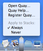
OK, so I’m dutifully rewriting my installer to move everything into /Library which has no such limitations. An added advantage is that now there’s a single copy of Quay installed for all users; but should the serial number, then, also be valid for all users? That means the added hassle of separating the preferences into yet another file, installed into /Library/Preferences; one more thing to uninstall. An added disadvantage is that, now, the uninstaller – which I’m building into the Quay application itself – will need to ask for an administrator password, too. Or maybe I should have a setuid root uninstaller tool inside the application; I don’t like that either, but having such a tool would also mean an easy way of adding extra functionality to the Quay popups.

Well, all these are trade-offs, and I hope that when 1.1 (final) comes out, that the net effect will be positive. If all goes well, 1.1b3 should be out sometime next week, and you’ll have the chance to comment. Stay tuned.

Connectium Tremens

No comments

My ADSL line has been down for almost 24 hours now – and it’s promised to be up in a few hours. But then, they already said that yesterday, to no effect . icon_rolleyes.gif First time it’s been down in over a year, so I can’t complain much.

I’m posting this from my neighbor’s poky connection; if you’ve e-mailed me in the last 24 hours, my apologies. It may still take some time before I can reply.

Re: Quay vs. 10.5.2

No comments

As predictable, interest in Quay has flagged a little with the release of 10.5.2. To quote one comment:

…pointless… since 10.5.2 brings back the functionality.

Well, in a certain way, true; to the extent that, once Apple shipped TextEdit, it’s pointless to use other text editors; it’s free and edits text, right?

Well, not really. I’ve changed the Quay product page to explain:

So why should you use Quay at all? Extra information, more flexibility. For one, the Dock’s popups are limited to about 500 items; Quay’s limit is in the tens of thousands. You can have a Quay popup on both sides of the Dock; Apple has them only on the document size.

And some comparative screenshots (this one is for “Sort by Kind”, 10.5.2’s popup is on the right):

Let’s hope this makes my point.

Re: Quay vs. 10.5.2

No comments

Mac OS X 10.5.2 (9C31) came out yesterday and I’m running it now. Seems they declared it stable enough to release… icon_wink.gif

So I’m declaring 1.1b2 stable enough to release too. I’m just checking if everything’s still working and updating the documentation; expect a release later today.

If you’ve installed 10.5.2, you’ll see an extra menu item in Quay’s general preference popup (option-command-click on the Dock divider stripe), to make Quay act only on Stacks set to “List” view. Some other 10.5.2-only goodies will show up in the next (and hopefully, final) 1.1.

I’ve gotten a serious amount of feedback on this beta. Thanks to all of you who sent in bug reports and suggestions. It’s the first shareware I’ve written for a larger audience and I couldn’t have foreseen all those various operating conditions without this sort of feedback.

Re: Quay vs. 10.5.2

No comments

OK, Quay 1.1b1 is out. Get it here.

Thanks to all who’ve sent in bug reports and suggestions. Quay 1.1b2 (or 1.1 final, let’s hope) will be out in a week or so.

Re: Quay vs. 10.5.2

No comments

Over 20 days since my last post on the subject, and Quay 1.1 is still a few days from release! But, thankfully, so is Mac OS X 10.5.2… I suppose they, too, ran into some last-minute snags.

Well, at least I can confidently report that the feature set and the user interface – at least on the popup menu side, which is generated by the background application – is now stable, and it looks pretty good even if I say so myself. Here’s a screenshot:

Let’s explain details from the top down.

The first line of course reminds you of which icon you clicked on, which is useful as the name disappears as soon as you click on it – and it also informs you about how many items there are in that folder.

The second line tells you in what order the actual items below are sorted (with the black arrow indicating ascending or descending). You can select quite a lot of keys for sorting: by name, creation date, modification date, Finder label, file size, default application for that file, file kind, and lastly you can get the list unsorted – meaning the strict alphabetical order that items appear in the file directory.

Then we have the actual items, and at the end an extra item which allows you to show the contents of the folder in the Finder.

Notice that most lines have right-aligned, disabled comments; in the screenshot, only folder content counts are being shown, as indicated by the heading in the second line. In the interest of speed (more about that later) these counts are of all first-level items only. Notice that this may include invisible items, so at first glance the counts may look wrong if you elected not to show such items in the list below.

You may elect to show on each line the Finder label color (indicated by colored dots to the left), file size, creation date, modification date, file sizes or folder counts – and you can elect to always simply show the key that the list happens to be sorted by at that moment. Don’t worry, all these options work together to show you just the right amount of information without clutter. Ah, and the date displays use the “short form” you set in your International preference panel.

Moving down, notice the funny-shaped overlay over the icon in the Dock. While I could, at this stage, reproduce the little triangle at the bottom of the standard Dock menus, I opted for using a visually distinctive state to emphasize that these menus are NOT generated by the Dock, but by Quay – this distinction hasn’t been properly absorbed by some users in the past. The dark-to-light/transparent-to-opaque gradient has been carefully designed and tested to be visible over a wide range of desktop pictures and Dock themes. It also furnishes a convenient clicking target for closing the menu again.

Finally, on the bottom of the screenshot, notice that the Quay icon is way over on the left side of the Dock; among the applications, in fact. Yes, you can now have Quay icons on both sides of the Dock! But, you will ask, can I now drag files onto these icons, as everybody requested…? (Sharp-eyed observers will also notice the 4,294 unread items in my NetNewsWire icon -no time for reading!)

Well, yes and no. No, the old-style Quay icons, which are built by the old-style two-step method of dragging a folder to the Quay window, then to the Dock, still won’t accept drags – but you can have your cake and eat it too! Just look at this preference menu you get by option-command-clicking on the Dock divider strip:

Right, starting with this upcoming version 1.1, all Stacks you have in your Dock can automatically show Quay popup menus and continue to accept dragged-on files as Stacks do. Just don’t check “Never” on the preference menu. Of course, this also means the two-step drag is now obsolete.

Obsolete, that is, unless you want to change the icon’s appearance instead of having the jumbled-up contents graphic. Well, that isn’t possible yet – at least with this combination of Quay 1.1 and Mac OS X 10.5.1 – but let me reassure you that you’ll have a pleasant surprise when 10.5.2 comes out.

Quay 1.1 has been, as I’ve said in past posts, Yet Another Complete Rewrite. The old ‘fake-file-starting-a-background-app-when-clicking’ could no longer do what I wanted, and of course, anybody could do that, right? So now I went to a completely new method. All clicks work transparently just like they do on the standard Dock, only the Quay popups appear instead – and you even can momentarily get the standard Stack displays by option-clicking – but you usually won’t notice.

Neither does the Dock itself notice anything; I’m still not hacking the Dock itself. “No magic” is still the mantra here, although I must admit that in 1.1 there’s some pretty complex technology substituting for it – and while I’m still not using any private API for that, I also must admit that I had to depend on the Dock’s implementation details quite a bit.

There’s lots of extra little Quay quirks (sorry) I don’t have time to explain. This post is already too long. But why isn’t it out yet? Well, basically installation has been changed completely, so I now have to rewrite that too, and I still have to redo the main Quay application to account for the left-side Dock option, and of course there has to be a completely new help documentation too.

So please folks, hang on for a few more days and check this blog, or use Quay’s “check for updates” facility, soon.

Update: oops, forgot to talk about speed. Well, the popup is now really fast; you won’t notice any delay unless your folder has over 1,000 items, and even for that case it won’t take more than a couple of seconds. Trust me: fast.

Some more thoughts about the Air.

I finally saw the pertinent parts of the keynote and paid attention to the shots of the Air’s interior and of the main board. Wow, that thing is cramped; 2/3 of it is battery. There’ve been serious announcements of progress in battery technology and for the next years we can expect even slimmer machines and/or longer capacity; still, it seems that Apple now considers 5 hours (if real) as a good compromise between bulk/weight and battery life.

The Air no doubt makes use of Apple’s recent patent (sorry, no time to find a URL for it) for glueing together a precision-cast aluminum chassis – meaning very few internal mounting screws and posts, much tighter tolerances, and serious amounts of weight and dimensions shaved off, as well as better heat distribution. It also means that the case feels like a single unit; it’s significant that people who’ve handled the Air report that it feels very solid, not at all fragile like it looks. Especially the moveable port door is said to feel solidly reliable.

People calling for a removable battery no doubt are unaware that such a thing would mean a huge case opening, meaning extra ribbing elsewhere to counteract the rigidity loss, mounting screws and a good lock, what amounts to a double wall inside the unit when the battery is mounted, a pair of connectors and so forth. Meaning perhaps 200g extra in weight, 4mm in depth and $50 (at least) added to the bill of materials… all to accomodate maybe 10% of users who need an extra battery for flying tourist class?

I remember from my hardware design days how there are cascading design choices like this. Someone comes in and says “can’t we do such-and-such” and they fall off their chair when you explain the consequences. Another example is the much-bemoaned lack of peripheral ports. But consider FireWire. Yes, Apple pioneered FireWire and it’s a great technology… but check the power requirements:

…[it] can supply up to 45 watts of power per port at up to 30 volts…

That would be the entire 45W of the external power supply right there! Admittedly Apple’s other laptops already lower that to about half by supplying less voltage. For instance, the FireWire developer note says for MacBooks:

The MacBook’s six-pin FireWire connector provides unregulated 9 V to 12 V power with a maximum load of 0.75 A. Developers should design to use 7 W sustained power, or less.

Contrast this to the new MacPro, which can supply 18W per port (28W total on all four ports), and you see how laptop power design considerations are important. Supplying 0.75A to get the standard 7W on a FireWire connector would have meant larger board traces, probably a thicker board, an extra power supply chip for the higher voltage, extra dissipation, cooling… not worth it. Lowering that requirement to 5W or less would mean many external drives not working properly.

The same reasoning applies to USB. A standard USB port must supply 0.5A continuously at 5V – 2.5W. The new MacPro and the latest revisions of the laptops (including the Air) support a special high-power mode where one port can supply 1.1A (5.5W). This was meant originally to allow the keyboard to work as a powered hub, supplying the regular 0.5A on each of its ports. The Air probably needs it for its external DVD drive, although the USB Developer Note says this only works for the keyboard – and supposedly the Air’s external drive doesn’t work on other Macs. Time will tell, but here too an extra USB port would have meant beefing up the machine, though not as much as a FireWire port would have.

Somewhat more puzzling is the limitation of the 80GB 1.8″ drive, as there are larger drives sold in iPods. Either Apple is already supply-constrained for those, or the slight differences in thickness and power consumption are significant; in any event, I expect the Air’s next revision to offer larger drives. Same for RAM; coming back to the pictures of the main board, notice there’s no space for extra RAM chips, meaning that 4GB will only be possible when the next chip series doubles capacity. (And a RAM socket? With a door? Forget it.)

Finally, all this is a great opportunity for acessory makers; expect a 4-port USB hub (powered, of course) with built-in gigabit Ethernet and media slots, for instance. Even for Apple itself, it might be interesting if Time Capsule allowed a plug-in DVD drive for remote access; it would just mean a firmware update, but I suppose the Air’s drive would be too much for the Capsule’s power supply.

Posted by shudder to think:
shudder to think wrote

Bookmarked your post over at Blog Bookmarker.com!

Photos licensed by Creative Commons license. Unless otherwise noted, content © 2002-2026 by Rainer Brockerhoff.
Iravan child theme by Rainer Brockerhoff, based on Arjuna-X, a WordPress Theme by SRS Solutions. jQuery UI based on Aristo.