Solipsism Gradient

Rainer Brockerhoff’s blog

Browsing Posts in Hardware

Re: iThingamajig

No comments

My reasoning about the possibly forthcoming iProduct was adopted by the nice folks at Mac+ (in Portuguese). For that piece, my friend, master illustrator Mario Amaya, made a few mockups which came out quite well.

Here is the closed device. I do disagree about shiny black – I think the aluminum Unibody design is more likely – but it does look good:

Regarding the name, by the way, “iBook” might be a good name to re-use if Apple really has the intention of doing to the ebook reader market what they did to the smartphone market. (It would also have the advantage that Apple already has all the registrations and trademarks.)

Here’s the opened device in horizontal browser mode:

This shows the foreground application on the top screen, and the virtual keyboard on the bottom screen. Note the URL and some other controls on the bottom, too. If there were other apps or widgets running in the background, either icons (Dock-like) or very reduced windows (Exposé-like) for each could be shown in a row above the keyboard.

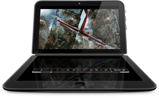
The same mode would also be used for movie watching:

and of course the movie player controls would substitute the keyboard. Notice how power consumption would be reduced by keeping most of the pixels on the bottom screen turned off – one advantage of OLED screens.

For gameplay the bottom screen would be folded completely behind the device:

The game would be controlled by the thumbs in front and by the other 8 fingers on the back screen (whose pixels would be completely turned off).

Finally, here’s one way of implementing the ebook mode:

While I would like this to be feasible, in a first-generation device it would mean that both screens have to be the same resolution; two HD-capable screens (1280×720 at 200ppi) will probably set the device’s price too high, or they’d have to go down to 1024×576 at 160 dpi, or even 800×450 at 120 ppi.

It’s more likely that the top screen will have full-HD resolution, and that the bottom screen would have just enough to show the virtual keyboard. 800 or 640 pixels wide might be enough. In this case, the ebook mode would look just like the game mode – second screen folded to the back – but in a vertical position.

The thickness of the device is, as I mentioned, about 20 mm in the closed position. For balance reasons, the battery has to be in the bottom part. If the ebook function uses a double screen, the two halves should have 10 mm each; otherwise, the top part could be very thin, maybe just 2 or 3 mm.

In fact, the battery will take up 1/2 to 2/3 of the device thickness – current battery energy densities are still far from optimal. No doubt in 10 or 15 years, we’ll have a very thin slate device, probably foldable in the middle, mostly made from graphene with an integrated supercapacitor. Such a device could be made as thin as 0.5 mm; no doubt they’ll then have to fluff it up with aerogel to a thickness of 5 mm or more, or else we won’t be allowed to take it on an airplane! icon_smile.gif

Also notice the iPhone-like Home button at the bottom, and the camera pinhole at the top. As I said, Apple has a patent for incorporating a camera into a screen, but this is unlikely to become reality anytime soon. For augmented reality a second camera in the bottom/back half would also be nice to have.

The mockups don’t show any external connector. It will either have a small folding door like in the MacBook Air, or an iPhone-like dock connector, I think.

iThingamajig

No comments

Here’s some wild speculation about the supposedly-soon-to-be-announced Apple Tablet. Rumors are flying fast and furious but all agree that the device will be based on a 9.7″ (or 10″) screen.

A week ago I saw compelling arguments that the Rumored Apple Tablet Is a Train Wreck. The article is quite logical: if Apple builds a touch tablet based on a 10″ screen, it will probably fail. It would be too large to use like an iPhone, holding it in one hand and touching with the other, and too large to carry in a pocket. It would also have to be relatively thick (and therefore, heavy) to protect the screen. Lying flat on a desk, the screen would be at a disadvantageous angle. In other words, it would be a keyboardless netbook; not Apple’s style at all. See the Amtek for an example of this.

Note that the word “tablet” is already too connected, in people’s minds, with certain features. I’m not sure what this new Apple device should be called; in fact, I hope that Apple avoids this designation entirely. I do think that it will, at least for its first generation, be primarily an entertainment device. More built for travel or leisure than for work, in other words.

Let’s look first at the constraints that Apple probably sees in such a device. First of all, they will want to avoid overlapping features with the existing product lines (or, at least, with where they’ll be taking these lines in the near future). So, the new device won’t have any direct phone functionality. It will of course play from a music library, as all Apple products do, but it’ll be too large to work as an iPod does. On the other side, it can’t compete with the low end of Apple’s laptops; this rules out running Mac OS X and/or having an arbitrary number of applications running simultaneously.

I see four basic applications for the new device: ebook reading, game playing, single-foreground apps like web browsing, and, perhaps, data entry. Current AppStore applications can do all of that to some extent, but are limited by the iPhone/iPod Touch’s small screen and puny input resources. So the new device needs a larger screen with full touch capabilities; 1280×720 pixels is necessary for HD movies, would be excellent for games, and reasonable for other applications. The screen would have to be thin, fast, brightly colored, and low-power. OLEDs seem to be the only technology available today that fits these requirements.

A 10″ OLED screen would have a pixel density of about 145 ppi. For comparison, a MacBook Air’s screen is 100 ppi, while the iPhone’s screen is 160 ppi. However, a serious issue with such dense screens is fabrication yield – the percentage of built screens that pass factory testing without too many defective pixels. Another problem with a single 10″ screen would be that a sizable portion of it will be taken up by a virtual keyboard or some other input control. A physical keyboard would make the device a small laptop and therefore is out of the question. Finally, the applications I listed above demand differing orientations of the device: horizontal for movies and games, vertical for ebooks.

One way of solving these problems is to use a clamshell-like design, but with two screens – more like a Nintendo DS than a netbook (this is also suggested by the “train wreck” author). Won’t two screens make it more expensive? Not at all, because of the yield problem, two smaller screens will probably cost 50% to 70% of a large screen. Making a 1280×720 screen at 200 ppi should be possible, giving a screen size 6.4″ by 3.6″ – about 163x92mm (roughly 7″ diagonal). With the same dimensions at 160 ppi, the screen would be 1024×576 pixels, keeping the 16:9 aspect ratio but sacrificing full HD capability.

So what’s near these dimensions? Well… I have here the paperback edition of “Cyberbooks” by Ben Bova (Jan.1990). It’s a quite funny story, but sadly out of print; the cyberbook’s inventor struggles against resistance by the entrenched publishing industry (hah!). This book is 178mm high, 101mm wide, and 20mm thick; easy to carry and to read.

And by a coincidence, these measures are only a few mm larger than the screen size I calculated above. So, for now, let’s assume a paperback-size device. I guess I should say mass-market-paperback-sized, as now there are these pesky “trade paperbacks”, which are not too well standardized, more expensive, and make me build my bookshelves larger than I want to – but I digress.

OK, let’s postulate a small book-sized device that opens in the middle. Each half measures 178x101x10mm, and the hinge is constructed to lock at certain angles. By the way, these are rectangular slabs with black glass on the screen side and Apple’s aluminum unibody elsewhere; the edges have to be rounded, but not much. The 10mm thickness is constrained mostly by battery capacity. Assuming the unibody back-wall to be 1mm, and the touchscreen to use up 2mm, we’ll have 6 to 7mm inside for a battery in one of the halves (the other half will contain the electronics). Apple’s new Li-polymer technology should allow for a 20 Watt-hour battery with these dimensions, by my rough calculations.

OLED screens have very variable power consumption; almost zero for black, maximum for white. Let’s estimate an average of 2W for each panel, and 3W for the electronics. This gives us a battery life of 3 hours when using both screens. If you play a movie on only one screen, this would go up to 4 hours; not too bad for a first-generation device. How would our applications work on this form factor?

Ebook reading: there are two options here, holding the “book” vertically as usual. Either we open the device 180 degrees, showing two pages, or we fold the right-hand screen completely behind the device. The second option is more likely, as only one screen would be active (reducing power consumption). Only the book application would be in the foreground.

Game playing: hold the device horizontally in both hands, with the bottom screen folded behind the device. Gameplay would be controlled with all 10 fingers (note that Apple has a patent for a touchscreen in the back of such a device). The back screen would be turned off to conserve power. Only the game application would be in the foreground.

Movie watching: this too is horizontal. The lower screen could be folded behind, as in the previous scenarios, or with the hinge locked at 110° as in a laptop, for sitting on a table. This would be stable as the bottom screen would be the one with the battery, which would be 2/3 of the device’s weight. Only the movieplayer application would be in the foreground.

Web browsing, or similar apps: two options. Horizontally, locked at 110°, the upright screen would show that foreground application, while the bottom screen would show the virtual keyboard, controls, and some status indicators. Vertically, with the device locked at 180 degrees, and joining the two screens into one – basically turning it into a classic tablet/netbook.

The 180 degree netbook mode is the one that has serious drawbacks. The hinge should bring the two screen halves together with a very small seam; tricky to implement, and making the screen edges sharper and more fragile. It also means that both screens would work at full brightness, raising power consumption. If the two screens are always separate, the lower/right one would be used only for virtual input – some bright pixels but a mostly black background, and then it could also have lower resolution – perhaps only half that of the main screen, lowering both costs and power needs.

Also notice that in all cases, there’ll be a single foreground app using the entire screen, and perhaps small widgets or background app icons on the “keyboard” screens. This also means that the device will run a version of OS X – no Mac-style interface, since that is very much tied to a mouse-type input device.

Further hardware refinements are possible. Apple has a patent on interleaving a camera with screen pixels. Doing that on both screens might be too expensive, but doing it on the screen that folds to the back might be just the thing for “augmented reality” applications. Haptic feedback? I don’t think there’s anything like that on the market yet. Voice input and stylus/handwriting input should be easy to do. An iPhone-style connector would be the minimum external interface (plus the usual audio connectors). Accelerometers, compass, GPS etc. will be built-in; an SD slot probably too.

Other details. The device will have any or all of the usual wireless connections – WiFi, WiMax, Bluetooth, 3G – but no direct phone capability. 32GB SSD storage would be a minimum. This will probably be the cue to roll out a CPU based on a P. A. Semi design; should it run the ARM instruction set, we’ll probably see current AppStore apps running in a compatibility box. In any event, Apple’s new Clang compiler technology means that supporting a new CPU architecture should be a piece of cake.

With all that, my tip would be a price in the $899-$999 range; rumors hint at a September 15th introduction, with availability sometime around the end of November. Will we see all of this in the first-generation device? Time will tell.
Re: WWDC 2009

No comments

The conference will be over tomorrow and I’m quite satisfied with the outcome. Now for some comments about the announcements and (NDA permitting) about what I learned.

I had some vague idea of going to some iPhone sessions and letting presenters (or friends developing for the iPhone) convince me that I should start developing for it. No such thing happened; session overlap was so severe, and there were so many labs to go to, and people to talk to, that I skipped any non-Mac session or discussion. What little I heard in the corridors confirmed my notion that the current state of iPhone development and the AppStore deviates too far from my preferred position as a utility developer – a niche Apple still keeps closed on the iPhone. Maybe when the tablet comes out… icon_neutral.gif

Speaking of tablets, while everybody agrees that one is in the works, it seems to be a year or so away from announcement. (Ditto for the new CPUs I hinted at, in my last post.)

Snow Leopard is the small new thing. Small for the user in a sense; it’s just refinements and greater speed. For developers, though, it’s the BIG new thing. And, as variously described as early as a year ago (can’t find URLs right now), much of the new stuff is driven behind the scenes by open-source projects Apple is driving: the Clang compiler, the LLVM back end, and the technologies made possible by Grand Central Dispatch, blocks and OpenCL. So, most of the sessions either expanded on this directly or offhandedly mentioned “there’s an API for that now – and it’s fully XYZ-enabled” (insert one of the technologies above).

These things have become possible because CPU chips had run into a clock frequency “sound barrier”; 3GHz is about the maximum current silicon can do without extensive and expensive cooling or exotic technology. So multicore has become the solution du jour: all Apple computers now have at least 2 core, and the top machine has 8 (16 virtual). Expect that number to double every 2 years, at least.

But for years multi-processor machines were hard to program. About 14 years ago, at another WWDC I bought a Genesis MP 528: this Mac clone had 4 PowerPC 604 processors running at a blistering 132MHz. It didn’t have much caching on those chips, and only Photoshop and a few other specialized apps could see more than one CPU, and that only for image filters. In two years the first PowerPC G3 CPU card, with a single processor but caching, running at 300MHz, had about the same Photoshop performance – and that performance was then available to all apps. So why didn’t more apps take advantage of the 4 CPUs? The classic Mac System 7 (to 9) had no easy way to allow for this; there was a very primitive multiprocessing API but the system was pretty much locked out of it.

As said in the keynote, Snow Leopard will support only Intel Macs; PowerPC Macs are, therefore, stuck in the Leopard era, and only some few bug fixes will appear on 10.5, then it’s over. I couldn’t find hard figures comparing the installed base; I’ve seen percentages quoted of between 10 and 35% of Macs Macs still in use being PowerPCs. I personally didn’t think this would dip below 25% before 2011; then again, as a stockholder, I’m glad Apple sold so many new Macs recently… icon_wink.gif

Some people question why PowerPC users will be left out of the Snow Leopard advantages, and I think I know why. While the top 4-CPU PowerPC machines still can hold their own with more modern machines under certain circumstances, the vast majority of PowerPC Macs have only 1 CPU; only a few big desktops have 2, and even fewer have 4. Most advantages of Snow Leopard come into play when you have at least 2 CPU cores, and there’s serious testing and bug fixing to be done for supporting an entire architecture. Apple probably just weighed those factors (with better numbers than I have available) and decided it wouldn’t work out.

Positives of the new Clang/LLVM combo: better compiler speed, better code optimization – both still starting out but they’ve more power in reserve, while the current gcc compiler and backends are pretty much maxed out; way better error messages, the Clang static analyzer is just awesome (a word I usually hesitate to use, but this really is!); lots of goodies to come from tighter integration with Xcode. Negatives: may still generate wrong/inefficient code in some circumstances; no C++ support yet (I don’t care myself about this one).

A sleeper advantage is, also, that the intermediate (LLVM) bytecode generated by Clang could possibly be stored as such inside executables, and be just-in-time compiled for execution on any target CPU. In other words, the same executable could run on a new machine Apple puts out, even if it has a new CPU chip/architecture, as long as the JIT compiler is in place for that; application developers wouldn’t have know (or care).

Regarding blocks (or “closures”, as they’re known in other places), they’re a syntactic convenience for programmers to pass executable code as data. As such, they make programs more readable. What makes them inordinately powerful in Snow Leopard is that they’re also the basic executable units for all of the cool new multiprocessing stuff in Grand Central Dispatch. Therefore, with a little discipline, it becomes easy for developers to chop up tasks into little slices than can be executed in parallel by however many CPU cores (or, with OpenCL, GPU units) are available to do them; and for the first time anywhere I know of, this facility is available throughout the system, even at a quite low level.

So, am I running off to convert all of my code to the new technologies? Well, yes and no. Many things still have to be done in a serial manner, and the system will do others in parallel behind my back. Also, it seems that writing a generic application that runs on both 10.5 and 10.6 (using the new stuff) is tricky; I’m still investigating how to best do it. Stay tuned for developments…

<blush>

No comments

Well, the nice folks at MacMagazine (thanks Rafael!) have republished a slightly updated version of an interview I gave a few years ago. It’s mostly about the 1985 Unitron Mac512, the very first Mac clone.

It’s in Portuguese, so here’s a translated-by-Google sort-of-English version. Rafael has hunted down some good pictures of an early prototype; I regret not having taken any myself.

Re: More tradeoffs

No comments

While most of yesterday’s Macworld keynote was uninteresting to me personally – I rarely use any of the updated software, and don’t have iTunes store access – the new 17″ MacBook Pro was mostly as I expected: the additional space was used for a larger battery, and more USB ports.

It was gratifying to see Apple’s battery page practically repeat my reasoning about the infrastructure (and wasted space) needed to accommodate removable batteries. (See also Chuq Von Rospach‘s discussion of the issue.) Not that the 15″ model’s infrastructure is quite as large as they show in the video, of course… but it makes the point well.

Judging from the pictures, the hard drive is inside a space that’s almost exactly square. In theory, they could have rotated the drive 90 degrees and made the battery 30mm wider, for maybe 10% more capacity. So why didn’t they do that? It would have meant extra weight, a beefed-up charging circuit, more heat dissipation, and either a larger power supply (which already is at 85W) or a longer charging time.

I don’t doubt that we’ll see incremental upgrades for iMacs and Mac minis rolled out without much fanfare over the next two months. My tip for the iMacs is that they’ll use the exact same front and back bezels as the corresponding-sized displays, with only a 10mm shim module inserted to accommodate the CPU and drives. The advantage, of course, would be that you could add a second display to your iMac with the exact same styling, screen parameters, and height; a good selling point. It would be a no-brainer for the 24″ model. I’m not sure that a 20″ display from Apple would sell well by itself, but if it used bezels and nearly all components from the 20″ iMac, it might be price competitive, and the styling advantage would be worth paying a few bucks extra. A 28″ iMac has been rumored; would that, then, mean that the current high-end 30″ display would be shrunk to 28″ too? I hope we’ll have the answer soon.

Re: More tradeoffs

No comments

Thanks to John Gruber for mentioning my recent analysis of the new MacBooks (and MB Pros).

From there, several other sites picked it up. The emphasis and comments on some were… interesting. Let’s go into that a little.

The article at Wired has a somewhat sensationalistic headline (which was copied by others): “Killing FireWire on MacBooks Was Necessary”. Well, a careful reading will reveal I didn’t say so outright. I said that under the design conditions that were chosen there was no good way to include a FireWire port on the MacBook. Also, most of my arguments didn’t touch on the FireWire port at all, and there were almost no comments about those; so I’ll mostly confine myself to FireWire in my answers here.

By the way, the lack of the FireWire port on the MacBook doesn’t necessarily mean that Apple is “killing” FireWire at all. Yes, Apple killed the floppy drive, ADB, serial ports and so forth; because no shipping Macs include these. Contrast to FireWire: two shipping laptops don’t have the ports, all others have them.

The Wired article also features some feedback from iFixIt, whose pictures of the laptop’s disassembly I’d linked to:

IFixit’s Luke Soules, who performed the disassembly of the MacBook cited by Brockerhoff, agreed with the engineer’s assessment that there isn’t room for a FireWire port given the new unibody design and motherboard layout. Soules added that it’s also important to keep in mind that the new MacBooks are substantially thinner than their predecessors (.95″ vs 1.08″).

I spent some time reading all comments posted to the various sites. Some people, as expected, hadn’t read my post at all, or not carefullly. After filtering out the noise, here’s a list of points of view expressed in decreasing order: (percentages sum to more than 100% since some people scored in more than one category)

35% say Apple/Steve Jobs are idiots and/or just want your money and/or don’t care as long as idiot Mac users pay. I don’t know how to respond rationally to that, so I’ll leave it to the specialists.

31% agree with my arguments, at least for the most part. Thanks.

25% say that Apple can do anything they want to, so they obviously didn’t want to in this case. These were about equally divided between people disagreeing with the particular trade-off chosen (which is reasonable) and people of the “bah just jam an extra port in there, make it so” variety (who overlap a lot with the first crowd, above).

(Most of the following arguments suggest inserting a FireWire port. To make things shorter, I’d like to recall my previous comments about any such port needing extra board space in form of a PHY (transceiver) chip and filters, several watts extra power supply requirements, extra battery capacity, all implying in either much shorter battery life or increasing the size of the machine. Yes, Apple could use Sony’s 4-pin connector, or leave the 6-pin connector unpowered, getting around part of the problem… but imagine the complaints!)

18% say Apple should have put an extra FireWire port elsewhere; on the other side, in front or on the back. Of course it’s not possible to put anything on the back – the hinge precludes that – or on the front, as that would have meant cutting down a little on the battery (refer to these photos). Putting one or more ports on the side, near the optical drive, means moving or shrinking the speaker (see also my comment below on the security lock). Some people objected to my describing this as an expensive solution, no doubt thinking of the cheap ribbon cables used inside desktop PCs. Well, inside a laptop such cables have to be thin and shielded against interference, especially at FireWire speeds. Think of your normal FireWire cable… with the thinner body, there’s little or no space to route that behind other components. In older laptops, Apple got partially around that problem by using very thin (and therefore, flimsy and expensive) flat cables.

15% say that Apple should have left off one USB port and put a FireWire port in its place. At first glance this sounds reasonable; port sizes are about the same, the functions are supposed to be about the same, and the existence of adapters like the USB->Ethernet adapter for the MacBook Air reinforce this opinion. (Many people also asked why Apple doesn’t bundle or make USB->FireWire or Ethernet->FireWire adapters; see more on that below.) Then again, some were complaining about having only two USB ports…

12% say that Pro users should buy the Pro models. However, much of the controversy is either about Apple’s definition of what “Pro” means, or about people wanting “Pro” features at “Con” price. It’s easy to forget that these are just temporary marketing names for price points.

11% complain that Apple is putting form over function, and letting the designers run free. Of course that’s Apple’s shtick, so to speak (ahem), and a big part of their appeal. (And yes, it doesn’t always work out fine.) But in my humble opinion that’s not the case with the MacBooks.

8% want even more things: more(!) USB ports, two FireWire ports for chaining devices (perhaps the “consumer pros”?), an ExpressCard slot, or one or more “media card” slots. Unsurprisingly, most of these also belong into the “make it so” group; they want it all, but in a small cheap package.

7% say that Apple should have moved the security lock to the other side (where it indeed is, in the MacBook Pros), and put a FireWire port where the notch in the motherboard is. But moving the lock would also mean flipping the battery latch mechanism to the other side, which would mean having the lock just above the hard drive, moving the optical drive upwards, and leaving no space for the speaker.

5% would opt for leaving out the Ethernet port and inserting a FireWire port there (nearly all of these were immediately contradicted by people who do need Ethernet). The Air’s USB->Ethernet adapter is a makeshift, since it can’t attain gigabit speeds. All Macs (except the Air) do have gigabit Ethernet, so… (Yikes! Apple would be killing Ethernet!!!)

5% say that Apple should have made the MacBook thicker or longer, or made the battery smaller. Can you imagine Steve Jobs signing off on that?

The rest are miscellaneous ideas: using stacked ports, leaving out the optical drive, crowding the connectors closer together, combining two ports, and so forth; and fall under similar arguments.

A common thread in many suggestions is a misunderstanding, or perhaps just ignorance, of the technical details of USB and FireWire. While their areas of application overlap, the solutions they offer are different, and so are the protocols they use. USB is master/slave, FireWire is peer-to-peer. Converting one to the other isn’t simply a matter of rearranging pins, or reencoding signals, as happens inside most video adapters; you’d need a fast processor and RAM to do that, and even so you can’t replicate special functions like target mode or streaming on the USB side. You’ll find very few such converters on the market, and they’ll all have some limitations.

Finally, a frequent question is “why doesn’t Apple just implement target mode on USB”? It’s not that simple. On FireWire, target mode is just a software matter – since the interface is peer-to-peer, no chip change is necessary. On the USB side, target mode would imply switching the originating Mac from master to slave and using a hard-to-find A-to-A plug. Current USB chips don’t support that, and connecting such a cable without the port being pre-switched would probably fry one end or both. The upcoming USB On-The-Go supplementary standard supports this over two new protocols and a new connector type; neither work over hubs, and it needs different PHY chips too.

Re: More tradeoffs

No comments

Posted by macsteps:
macsteps linked to this post

Farewell Firewire, Nice Knowin’ Ya

The Mac community seems to be quite enraged about Apple’s decision the slowly get rid of Firewire on the new MacBooks. The newly-introduced smaller MacBook (13-inch) has no Firewire port whatsoever and the larger MacBook Pro (15-inch) only has a …

Re: More tradeoffs

No comments

Posted by Geek News Central:
Geek News Central linked to this post

Psystar Still At it – Now With Notebooks

Six months ago, Psystar entered the Desktop arena with a PC for $600 that could get your choice of Windows, Linux or Mac OSX. Of course Apple responded with a Lawsuit and Psystar countered. Every time we speculated Psystar is…

Photos licensed by Creative Commons license. Unless otherwise noted, content © 2002-2024 by Rainer Brockerhoff. Iravan child theme by Rainer Brockerhoff, based on Arjuna-X, a WordPress Theme by SRS Solutions. jQuery UI based on Aristo.