It’s been a busy month with many interruptions. So we interrupt our hiatus to present you a <cue trumpets!> philosophical update on XRay 2.0.
As I mentioned before, 2.0 is being rewritten from the ground up. No source code, graphics or window designs from 1.x will be reused. XRay was my very first Cocoa application and while I got it working, often in ignorance of the right way of doing things, it’s beginning to show its age and maintaining it is becoming a difficult and, dare I say, embarrassing proposition. Starting again from the ground up has so far been as much fun as I had hoped.
The first important decision was of course to code for Panther (Mac OS X 10.3) and up. The statistics show that around 93% of the users that downloaded 1.1 are already on Panther, and until 2.0 comes out earlyish next year I hope that most of the holdouts will also have upgraded; so this hopefully won’t be a big issue. Cocoa on Panther has many added features that I’ve always been eager to take advantage of, so the user’s benefits will be smaller code with less hacking around limitations.
One new-for-Panther API that I won’t use yet is Cocoa bindings. From the many questions and head-scratching I see on the developer lists, this technology still isn’t as fully documented as I’d like, and some of it is still evolving. Also, it acts in an indirect way – bindings seem to be, essentially, useful side effects – that appears to be difficult to debug for someone who has only now fully absorbed things like Interface Builder’s outlets and actions. So I’ll pass on this for now and will look again at it when Tiger (Mac OS X 10.4) comes out.
Q: How many Mac developers do you need to change a lightbulb?
A: Six. One to come up with a snappy project codename, one to design the team T-shirt, one to draw the icon, one to design a completely new GUI, one to hack out a public beta of the lightbulb over the weekend, and one to draft the memo to management to ask for more powerful development hardware. 😆
As it’s just me toiling away here in the code mine, I skipped steps #1 and #2; the last step will hopefully be possible when a new 17″ PowerBook comes out. So I decided to make a new GUI and base the new icon on it. At the same time, I needed to have a strong reference to the original XRay icon:

I drew this icon overnight at MacHack 2001 and it’s become one of my most successful icons. Still, it’s based on the original Mac OS X aqua interface and I wanted to emphasize that the new version will be Panther-only, so here’s a preliminary rendition of what it will look like:

By the way, I successfully resisted changing the blue X to Jaguar fur (shudder) when 10.2 came out; it didn’t scale well. And it looks like Tiger will keep the metallic look of 10.3, so the new design should look up-to-date for some time.
While trying to draw the new icon I became obsessed with getting the metal texture exactly right, while not copying outright the metallic X best seen in Apple’s Installer window background. Not only because of trademark considerations, but also because it proved devilishly hard to reproduce. For one, the X isn’t drawn in any publicly available font; for another, the subtle shading effects would be mostly covered by the XRay “film”. So I settled for using the standard “metal window” background for the X, which is also instantly recognizable.
As I tried to draw the new icon in several sizes, including the 256×256 extra-large size required for Tiger compatibility, I noticed that the metal texture and edge shading shouldn’t scale with different sizes; also, the curvature of the film corners looked better when kept the same. In order to impress other programmers with my l33t C0c04 sk1llz, I decided to make the “About Box” window’s background into a scaleable version of the icon itself. This in turn led me to learn about partially transparent windows, the way window backgrounds, views and window controls are drawn, and how to produce various interesting animation effects. Eye candy, to be sure, but useful and impressive eye candy.
Again, what I learned in doing the “About Box” immediately suggested interesting options for the main GUI. Originally, XRay was a complement to the Finder’s single “Get Info” window, which in the days of 10.0 and 10.1 was seriously underpowered. Also, users migrating from Mac OS 9 were clamoring for separate info windows for different items, so XRay was patterned after the Mac OS 9 “Get Info”. XRay information windows were supposed to be relatively large and well-readable while still being small enough to allow having several of them open.
But times changed. With 10.2 and 10.3 the Finder’s “Get Info” changed to a different format and it also became able to do formerly missing things like changing permissions and deleting stubborn files with Administrator authorization. I noticed that I very seldom had several windows open anymore, and that my usage of XRay’s permissions panel was also rare. Many users were asking for batch-mode operations which the one-window-per-file paradigm didn’t accomodate well. At the same time, my idea of writing plug-ins to allow XRay to examine the internals of different file formats was running into snags, both because of the limitations of my first plug-in API design and because of the smallness of XRay’s windows.
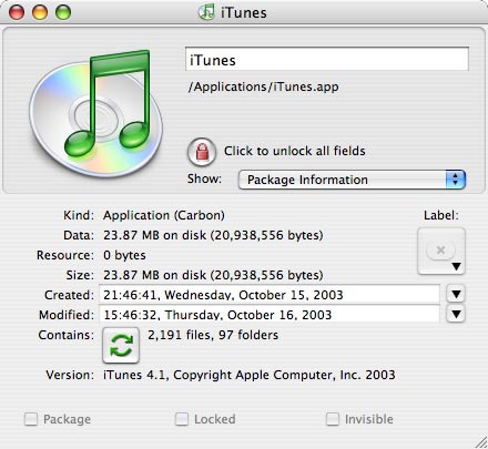
So the new XRay will have one large window instead of several smaller ones. In other words, it will follow the quite successful browser paradigm of applications like iPhoto and iTunes: lists of favorite items, a structured large (but collapsible) browser pane, and another structured+collapsible information pane. Exact details are still being worked out, so I can’t show a window image yet. However, one problem presented itself immediately: Apple’s guidelines suggest using a metal window for this sort of application, as indeed iTunes, iPhoto, the Address book and several others do. It turns out that I like the metal interface well myself, but most of my beta testers hate it with a passion. Making the interface a user preference was immediately obvious, but forcing the user to restart the application to change it didn’t seem right; unfortunately Cocoa windows can’t be changed after they are open.
Well, my experiences with the non-standard “About Box” immediately suggested a possible way to do user-selectable window themes on-the-fly, and after some surprising detours I’m happy to report that it seems to be working well. Of course, all user interface widgets have to change theme as well when the window’s theme changes, and as I had to do some non-standard widgets for the “About Box” anyway, it proved relatively easy to extend the new concepts to the whole UI. This in turn led to the possibility of developing an entirely new theme, which in turn caused me to investigate other parts of Cocoa I hadn’t had occasion to explore before…
The challenge in these cases is to do new widgets in a style that is immediately obvious and coherent with existing widgets, or even in a way that most people won’t even notice that they’re not standard. Looking through current Apple applications that use the metal interface I was surprised to see a wide variety of non-standard widgets; evidently Apple is using their own applications as a development laboratory, in the sense that the most useful new widgets tend to become standard interface items in subsequent system versions. Hopefully my own UI items will be unobtrusive in this way.
More later…


