Over 20 days since my last post on the subject, and Quay 1.1 is still a few days from release! But, thankfully, so is Mac OS X 10.5.2… I suppose they, too, ran into some last-minute snags.
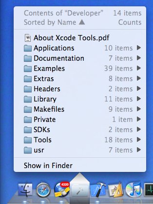
Well, at least I can confidently report that the feature set and the user interface – at least on the popup menu side, which is generated by the background application – is now stable, and it looks pretty good even if I say so myself. Here’s a screenshot:

Let’s explain details from the top down.
The first line of course reminds you of which icon you clicked on, which is useful as the name disappears as soon as you click on it – and it also informs you about how many items there are in that folder.
The second line tells you in what order the actual items below are sorted (with the black arrow indicating ascending or descending). You can select quite a lot of keys for sorting: by name, creation date, modification date, Finder label, file size, default application for that file, file kind, and lastly you can get the list unsorted – meaning the strict alphabetical order that items appear in the file directory.
Then we have the actual items, and at the end an extra item which allows you to show the contents of the folder in the Finder.
Notice that most lines have right-aligned, disabled comments; in the screenshot, only folder content counts are being shown, as indicated by the heading in the second line. In the interest of speed (more about that later) these counts are of all first-level items only. Notice that this may include invisible items, so at first glance the counts may look wrong if you elected not to show such items in the list below.
You may elect to show on each line the Finder label color (indicated by colored dots to the left), file size, creation date, modification date, file sizes or folder counts – and you can elect to always simply show the key that the list happens to be sorted by at that moment. Don’t worry, all these options work together to show you just the right amount of information without clutter. Ah, and the date displays use the “short form” you set in your International preference panel.
Moving down, notice the funny-shaped overlay over the icon in the Dock. While I could, at this stage, reproduce the little triangle at the bottom of the standard Dock menus, I opted for using a visually distinctive state to emphasize that these menus are NOT generated by the Dock, but by Quay – this distinction hasn’t been properly absorbed by some users in the past. The dark-to-light/transparent-to-opaque gradient has been carefully designed and tested to be visible over a wide range of desktop pictures and Dock themes. It also furnishes a convenient clicking target for closing the menu again.
Finally, on the bottom of the screenshot, notice that the Quay icon is way over on the left side of the Dock; among the applications, in fact. Yes, you can now have Quay icons on both sides of the Dock! But, you will ask, can I now drag files onto these icons, as everybody requested…? (Sharp-eyed observers will also notice the 4,294 unread items in my NetNewsWire icon -no time for reading!)
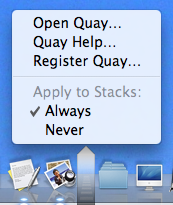
Well, yes and no. No, the old-style Quay icons, which are built by the old-style two-step method of dragging a folder to the Quay window, then to the Dock, still won’t accept drags – but you can have your cake and eat it too! Just look at this preference menu you get by option-command-clicking on the Dock divider strip:

Right, starting with this upcoming version 1.1, all Stacks you have in your Dock can automatically show Quay popup menus and continue to accept dragged-on files as Stacks do. Just don’t check “Never” on the preference menu. Of course, this also means the two-step drag is now obsolete.
Obsolete, that is, unless you want to change the icon’s appearance instead of having the jumbled-up contents graphic. Well, that isn’t possible yet – at least with this combination of Quay 1.1 and Mac OS X 10.5.1 – but let me reassure you that you’ll have a pleasant surprise when 10.5.2 comes out.
Quay 1.1 has been, as I’ve said in past posts, Yet Another Complete Rewrite. The old ‘fake-file-starting-a-background-app-when-clicking’ could no longer do what I wanted, and of course, anybody could do that, right? So now I went to a completely new method. All clicks work transparently just like they do on the standard Dock, only the Quay popups appear instead – and you even can momentarily get the standard Stack displays by option-clicking – but you usually won’t notice.
Neither does the Dock itself notice anything; I’m still not hacking the Dock itself. “No magic” is still the mantra here, although I must admit that in 1.1 there’s some pretty complex technology substituting for it – and while I’m still not using any private API for that, I also must admit that I had to depend on the Dock’s implementation details quite a bit.
There’s lots of extra little Quay quirks (sorry) I don’t have time to explain. This post is already too long. But why isn’t it out yet? Well, basically installation has been changed completely, so I now have to rewrite that too, and I still have to redo the main Quay application to account for the left-side Dock option, and of course there has to be a completely new help documentation too.
So please folks, hang on for a few more days and check this blog, or use Quay’s “check for updates” facility, soon.
Update: oops, forgot to talk about speed. Well, the popup is now really fast; you won’t notice any delay unless your folder has over 1,000 items, and even for that case it won’t take more than a couple of seconds. Trust me: fast.
